Drop us a few lines about the task and we will get back immediately to see we how we can take the discussion forward. Alternately, just pick up the phone and speak with us at +91 9910034330 and we would be happy to help.
- - Do tell us a little about the nature of your business.
- - Be specific about what you’d like us to help you with.
- - Knowing your budget always helps us plan a suitable intervention.
- Blog
Designing for Social Media for Non-Graphic Designers (Part 3 of 3)
-
Designing for Social Media for Non-Graphic Designers (Part 3 of 3)
Hello and welcome to the last part of the series. In part one and two, we looked at a wide variety of aspects of graphic design, namely visual language, format, spacing, type selection and colour. Today we will talk about background and technical difficulties:
6. Background
Photographs can make beautiful backgrounds but have to be chosen carefully. Great photographs almost always ensure high engagement, especially the ones which feature people. Try and choose photos which are not too busy where the text has to come, otherwise your text can get lost. Use a colour which stands out against the photo, but also goes well with it, or you might want to put your text in a coloured / translucent box. You might have to use a bolder font, make it larger or use drop shadow. If you are using a plain background, an overlay of paper texture or any other simple texture can add a great deal of visual interest.
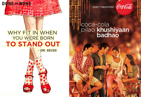
Look at the visuals below used by DONE by NONE and Coca-Cola. DONE by NONE has used text over an illustration in a box to convey the message clearly. Coca-Cola has used a photograph where the picture doesn’t interfere with the text. This makes sure that the viewer pays equal attention to the picture as well as the written message. The white text stands out against the dark background.
7. Technical Glitches
Quite often while we save an image it gets pixellated, even though it appears fine while we work on it. Pixellated pictures can be annoying to look at and can seriously tarnish the reputation of the brand. There are some tricks to prevent that from happening. Always check that the resolution of your artwork is at least 72 dpi. While designing for the screen, it is important that you change the view settings to pixel preview so that it shows you exactly how it’s going to appear on the screen at 100% zoom. When you do this, you can also make sure that your text remains legible at that size. Sometimes while working with photographs we tend to blow up low quality images to a considerable amount, making it pixellated. Always ensure that the photograph you’re using is of high quality and you don’t have to blow it up more than 200%. Even then if it pixellates, you can repair it by using a blur filter set to 2-3 pixels, to soften the sharp pixels. Then use a sharpening filter, but using it excessively can make your image look harsh. Try playing around with other artistic filters, but not excessively. Save your image as a PNG instead of a JPEG because it employs lossless data compression.
The following images have been resized using JPEG and PNG compression. Can you guess which is which?
At the end of the day, the user is the best judge, and engagement on the image is the best way to measure its effectiveness. So it is important to do a little bit of research to figure out what clicks with your target audience. Don’t lose heart if you’re not too well-versed with the softwares. It will come to you with practice. Your imagination is a much more valuable tool than Photoshop. Feel free to add to this list of guidelines. Happy designing!
Disclaimer: Views of authors are personal and do not represent the views of Blogworks, or any of its clients.
-
Contact
conversations@blogworks.in
+91-9910034330 -
Newsletter
-
Social


