Drop us a few lines about the task and we will get back immediately to see we how we can take the discussion forward. Alternately, just pick up the phone and speak with us at +91 9910034330 and we would be happy to help.
- - Do tell us a little about the nature of your business.
- - Be specific about what you’d like us to help you with.
- - Knowing your budget always helps us plan a suitable intervention.
- Blog
Designing for Social Media for Non-Graphic Designers
-
Designing for Social Media for Non-Graphic Designers
In today’s world where we are increasingly bombarded by information and web content, our attention span has become really short. We merely glance at the content before us for a fraction of a second before deciding whether to give it more time, or to just keep scrolling. It is not surprising then that graphic design has come to play a crucial role in social media. In addition to good quality written content, it is also important to present it in an attention grabbing way. For a non-graphic designer, it is important to know some basic guidelines if you want to do it on your own. This is the first instalment of a 3-part series on designing for social media, which (combined with your inherent graphic design sensibilities and great copy) will ensure that your visual content gets its fair share of attention from the user.
1. Visual Language
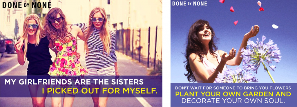
It is very important to follow the visual language of the brand in order to strengthen brand recognition. Chances are that your graphic designer has already provided you with a brand manual and it is a must to follow those guidelines. The imagery, the use of type and colour, the placement of the logo all speak volumes about your brand if you know how to use them properly and consistently. Scroll down to look at how Coca-Cola and DONE by NONE express themselves through their distinct visuals. What do they communicate to you?
2. Format
Let’s divide your template into 3 sections: the title / masthead, the body text and the bottom margin.
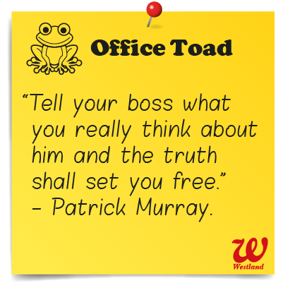
Make sure that the title looks pleasing to look at and yet not so overwhelming that it distracts the eye from the main content. It’s a great idea to play with the title typographically or to beautify it with a small icon or illustration, depending upon the nature of the brand. Make it into a small unit by arranging the type, changing the colours, enclosing it in a coloured band etc.
Keep your main content crisp and concise, because no one wants to read long strings of words, and you don’t want your template to look cluttered. Let the content dictate the design, because the very purpose of designing is to enhance and support your content, and not merely embellish a mediocre message.
Lastly, a word on alignment. Do not align your body text to the right. Human beings are creatures of habit. We are used to seeing text aligned to the left or to the centre. Keep the same alignment for your title and your body text to make it look put together. Do not fully justify your text because that results in an undesirable phenomenon known as rivers. Balance your ragged edges in an aesthetically pleasing manner.
The bottom margin (or even the top margin) can be used for placing the company’s logo according to the brand manual. This can be aligned to the rest of the format, and can also appear on the right hand corner.
In part two we will take a closer look at spacing, type selection, and colour. In the meanwhile, feel free to ask any questions on design that you might have.
Disclaimer: Views of authors are personal and do not represent the views of Blogworks, or any of its clients.
-
Contact
conversations@blogworks.in
+91-9910034330 -
Newsletter
-
Social


