Drop us a few lines about the task and we will get back immediately to see we how we can take the discussion forward. Alternately, just pick up the phone and speak with us at +91 9910034330 and we would be happy to help.
- - Do tell us a little about the nature of your business.
- - Be specific about what you’d like us to help you with.
- - Knowing your budget always helps us plan a suitable intervention.
- Blog
Designing for Social Media for Non-Graphic Designers (Part 2 of 3)
-
Designing for Social Media for Non-Graphic Designers (Part 2 of 3)
In the first part of this series, we looked at the basics of visual language and format. Today, I am going to explain how spacing, type and colour can make your visuals come alive.
3. Spacing
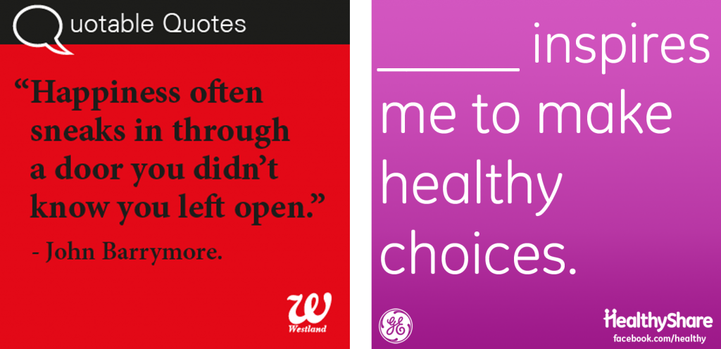
Negative spaces are as important in a template as anything else. Very often people tend to fill these spaces with more words, or clip arts, because, hey I’ve got all this space and it’s going to waste! Big mistake. It is very important to maintain legibility and harmony in your templates by giving them a healthy amount of breathing space. Make sure that the different elements of your visual do not interfere with each other. The amount of space should preferably be in the following order: bottom margin > top, right and left margin> paragraph break > line space > word space > letter space. However, this is a very traditional and safe rule that seasoned graphic designers might not stick to. But remember, it is important to know and master the rules before you are qualified enough to break them.
Let’s look at these two templates used by Westland Books and General Electric. They have used their external and internal spaces very differently. Which one do you think has balanced them better?
4. Type Selection
This can be tricky for people who are not well acquainted with typefaces. First, there are legal issues. Since pirated typefaces are used freely in our country, it is very important to check online whether you have the permission to use them, because the web does not have any national boundaries, and your company can be sued by type foundries for using pirated typefaces. Also, free typefaces can often be hideous to look at. Font Squirrel comes to our rescue with free to use quality typefaces which are categorised by style. Typefaces, when used wisely, can add great aesthetic value to your template. To be on the safer side, choose from the sans serif collection before you start experimenting. Don’t use too many typefaces. Don’t use more than 2, in fact, the safer option would be to use different weights of the same typeface.
Check out how Artic Vodka India has used type. Using light weights of a typeface can add elegance. Random House India has used a beautiful art deco typeface (below right) and played around with the typography.
5. Colour
Stick to a colour scheme of 2 to 3 colours, because more colours can be difficult to handle. The RGB colour model makes it possible to use a wide variety of colours but you can considerably streamline your choices according to the kind of audience that you’re trying to target. Your brand must also have a colour scheme. Use brights and complementaries (but do not use blinding, jarring combinations) for a youthful look and feel. Add a touch of grey for sophistication. I’m a great fan of grey because it can be used with almost any other colour. Instead of keeping the background white, use another light colour, because it is important for your template to stand out against the (usually) white background. Instead of using black for text, try using a deep blue, or red, or green, grey etc. Keep the use of brown to a minimum, because very few people know how to use that colour without making it look ‘muddy’. Color Scheme Designer is a great web based tool to try different colour schemes and see how they look when used in combination with each other. Kuler, a community where users share colours schemes, can come in handy. I will talk more about colour schemes in my subsequent posts :)
Now that you’ve learnt a decent number of graphic design basics, start noticing the graphic design that is all around you. Try and dissect it based on the points that we’ve discussed above. Do post your observations below :)
Disclaimer: Views of authors are personal and do not represent the views of Blogworks, or any of its clients.
-
Contact
conversations@blogworks.in
+91-9910034330 -
Newsletter
-
Social


